Key highlights:
- Gold has formed a pattern like the 2013 wave, with decreasing highs being formed after a solid move towards 2026.
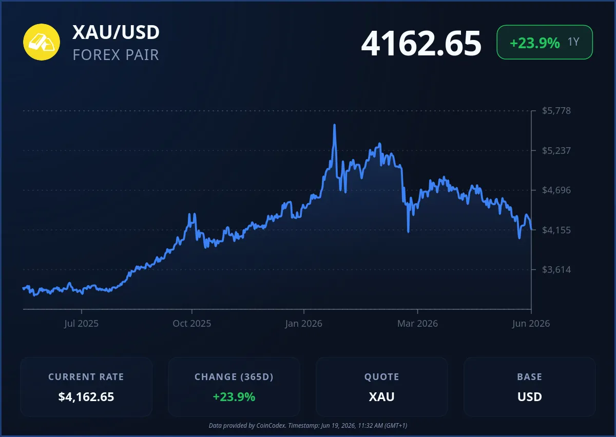
- The gold price has fallen by more than 25% from its high, thus moving into a deep correction phase like other bear waves.
- There is a macro effect due to the hawkish stance of the Federal Reserve, ETF selling, and rising real interest rates.
The gold price is at a point where traders are starting to compare it with past cycle behavior, especially the 2013 downturn. A chart shared by analyst Lenion draws a side-by-side view of 2013 and the current 2026–2027 structure, and both look surprisingly similar once you zoom out.
The chart comparison looks a lot like 2013, with lower highs forming and a clear downward trendline. The gold price is already down more than 25%, which lines up with early bear market-style behavior playing out again.
Gold moves from peak strength into correction phase
The gold price peaked near the $5,600 per ounce area in 2026 before entering a downside move that’s already around 24% from the top, based on the data shared in the post. That kind of move puts it in a similar phase to 2013, when gold dropped about 20.51% after its earlier cycle peak.
In both cases, the move didn’t happen out of nowhere. The rally came first, powered by inflation concerns, crisis demand, and strong liquidity conditions. Once the top formed, momentum faded, and the structure flipped into lower highs and lower lows. Back in 2013, that eventually led to a bottom near $1,117.87 after a drawn-out decline.
🚨 GOLD IS REPEATING THE SCENARIO OF THE 2013 CRASH
I've seen this before and I don't like how it ends
Back then, people also believed that after years of gains, it was just a correction
Since the beginning of 2026, gold has already fallen about 24% from its all-time high of… pic.twitter.com/40uzx9wKkf— Leni (@lenion) June 18, 2026
The current chart is showing a similar structure, with a clear downward trendline forming from rejected highs. The projection on the chart keeps pointing lower toward the $3,000–$3,400 area if the same pattern continues to play out.
Macro pressure around the gold price
The macro backdrop is one of the key reasons this comparison is getting attention. In 2013, the Federal Reserve’s tapering talk and rising real yields weakened gold’s appeal. Fast forward to now, and the environment carries familiar traits: a still-hawkish Fed, elevated real yields, and a stronger U.S. dollar.
ETF flows are also part of the picture. In the earlier cycle, sustained outflows marked the start of deeper weakness. In the current setup, March recorded noticeable gold ETF outflows again, which lines up with early-stage distribution behavior seen in past corrections.
At the same time, safe-haven demand has cooled compared to earlier periods. With geopolitical tensions easing in some areas, capital has started rotating back toward risk assets, reducing one layer of support for the gold price.
What this means for the gold price going forward
Right now, the gold price is stuck between two forces. On one side, there’s still central bank demand supporting the long-term picture. On the other side, ETF outflows, tight monetary conditions, and weaker momentum are weighing on price behavior.
If the 2013 comparison continues to hold, the chart projection keeps the focus on deeper downside zones around $3,000–$3,400. If that pattern breaks, gold would need to reclaim trendline resistance and stabilize flows to avoid further downside pressure.
According to CoinCodex’s 1-month gold price prediction, the price could move toward $3,841.39 over the coming weeks, as traders continue to assess whether the current correction phase still has room to extend or begin stabilizing near key support zones.